Building OMNi’s design system was a pivotal project that enabled our team to deliver a consistent, high-quality user experience across the app. By standardizing our components and patterns, we not only saved time but also empowered designers and developers to work more effectively. The end result was a visually cohesive and user-friendly app that delighted both our team and our stakeholders, setting OMNi apart in the market.
Goals
Universality in UI: Ensure a consistent look and feel across all sections of the app, enhancing user experience and brand cohesion.
Reduce Development Time: Enable faster development with shared components, making handoff smoother and minimizing repetitive tasks.
Consistent UX Patterns: Establish intuitive UX patterns that would allow users to move seamlessly through different sections.
My Role and Team
As the Design Lead, I led a team of three designers, managed their tasks, and coordinated efforts across departments. I worked closely with:
Marketing: Confirmed that our choices fit their vision for the new brand.
Founders and Strategy: Got their approval on the final look and feel to make sure we were meeting the big-picture goals.
Engineering Team: Worked closely with them on the technical side to confirm feasibility and check that our designs wouldn’t hit roadblocks later.
Design ApProach
Component & Patterns Audit
We started by creating an inventory of existing UI components and patterns, making note of what we’d keep, redesign, or create from scratch.
We started by creating an inventory of existing UI components and patterns, making note of what we’d keep, redesign, or create from scratch.
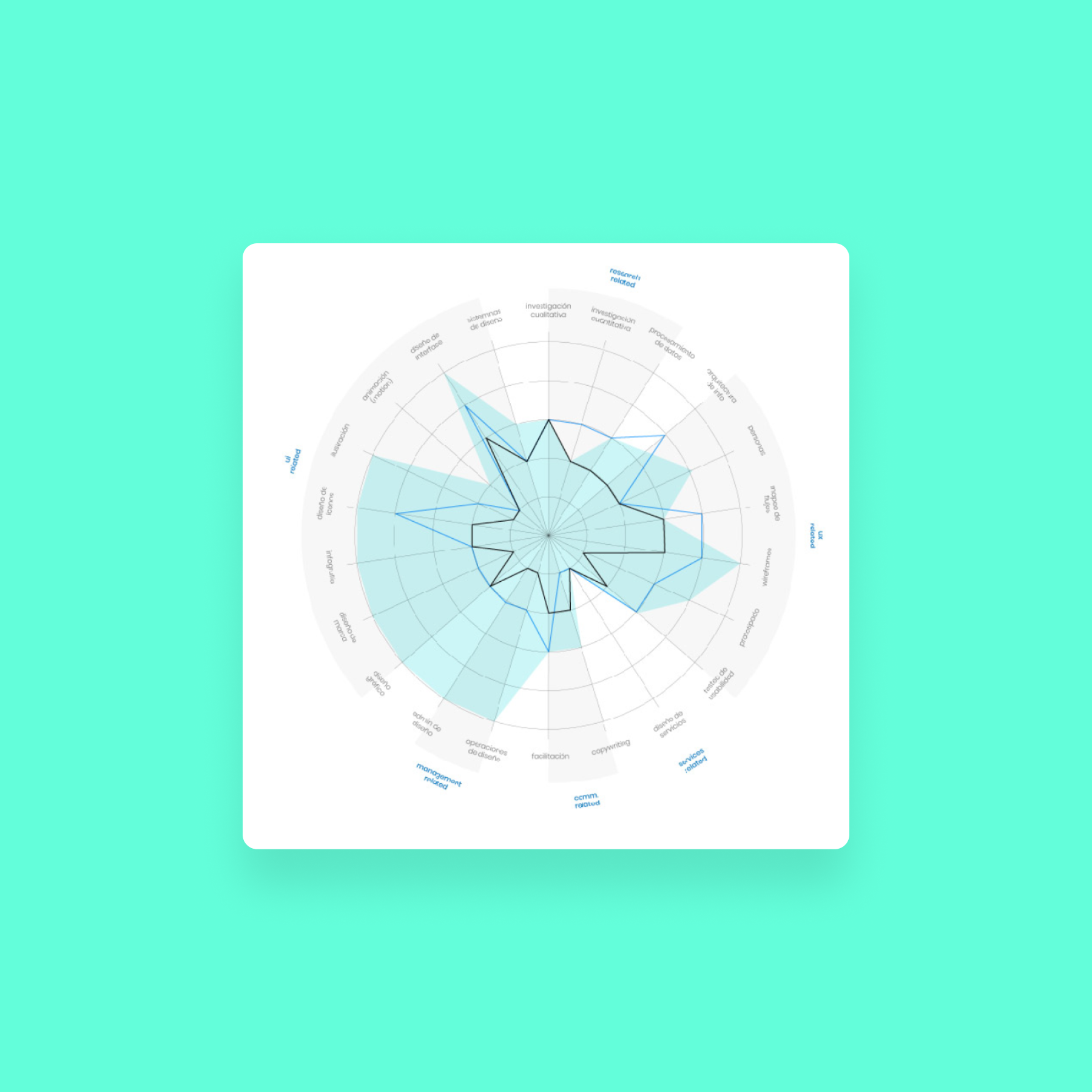
Team Task Distribution
Look & Feel Exploration
From there, we gathered references, built mood boards, and explored multiple design directions to settle on a look that fit our updated brand identity.
From there, we gathered references, built mood boards, and explored multiple design directions to settle on a look that fit our updated brand identity.
1st Iteration of New Look And Feel
Design and Development
We built out a style guide, designed a component library, and wrote up usage guidelines that were clear, accessible, and easy to follow. It took several rounds of feedback with both the design and engineering teams, but each iteration helped us fine-tune the system to meet everyone’s needs.
Example of Components And Usage Rules
Challenges and Solutions
Keeping the design system updated and relevant
We created a team dedicated to maintaining and growing the design system, continuously updating components and refining patterns based on designer feedback.
Navigating technical limitations
By working closely with engineers, we adjusted and optimized components to fit within our technical scope without sacrificing quality.
Results
Faster Design Process
Designers could move more quickly with our extensive component library, saving time that used to go into creating UI elements from scratch.
Cohesive Look Across App Sections
A seamless brand experience that users could recognize and trust in every section of the app.
Easier Onboarding
New designers ramped up quickly thanks to clear UI behavior guidelines and an organized library.
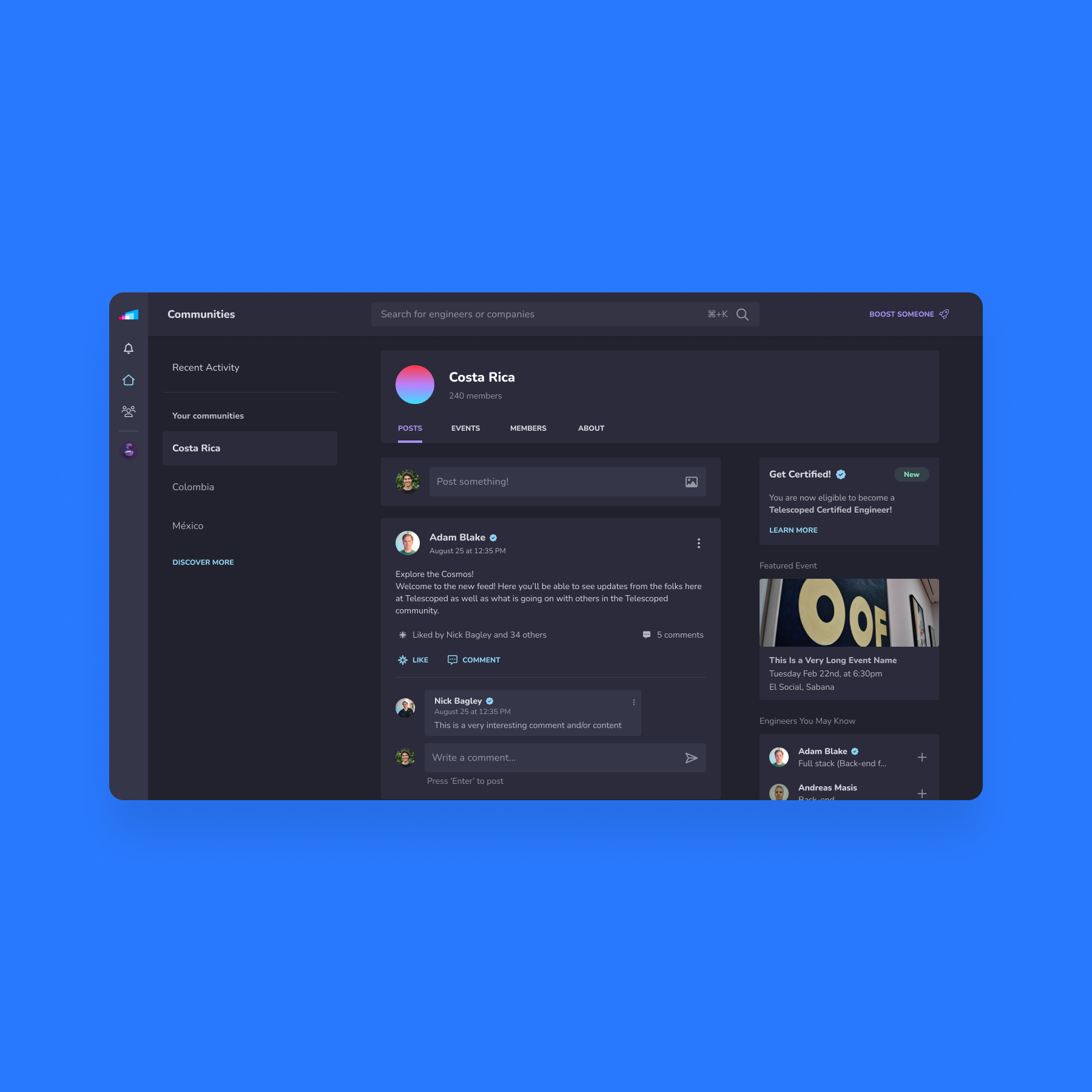
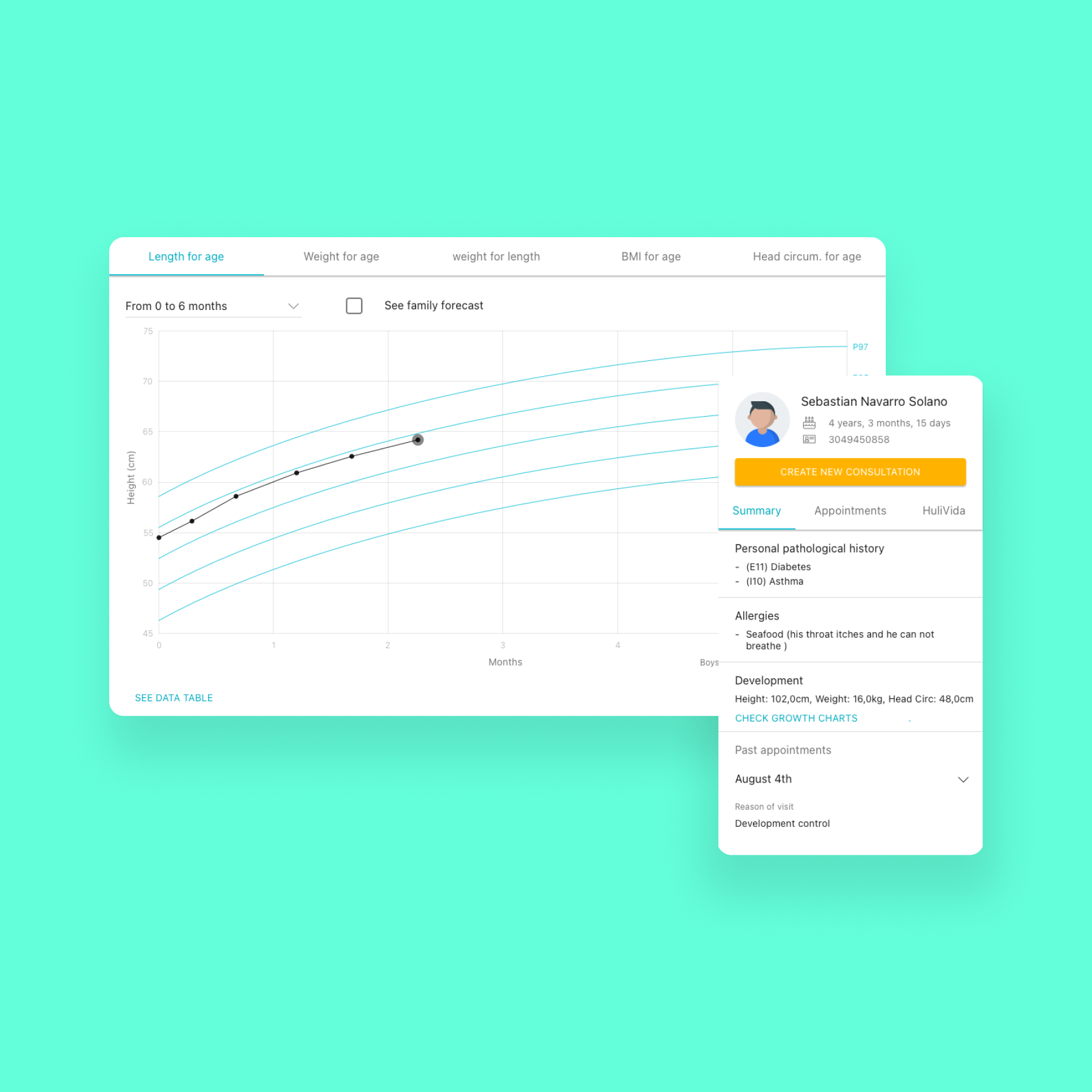
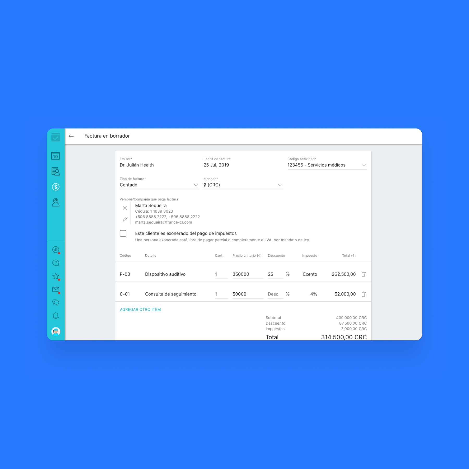
New Design System Applied To Existing Product
Lessons learned
Collaboration Is Key
Early alignment with marketing, engineering, and leadership made the project smoother and the system stronger.
Adaptability Drives Success
Flexibility kept us moving forward, even as brand goals or technical needs changed.
Listen to Your Users
Treating our designers as “users” helped us build a system that was truly practical and loved by the team.


